I have been asked a couple of times by the customers if there are any fancy rating controls like a star, stack etc. available in D365 rather plain numbers, the only option was Html earlier and now with the power of PowerApps Component Framework, it’s not the case. And to make it more interesting, the Custom Rating Control is so flexible that it can be configured to use any icons depends on the business process, I have used the skull to rate Thanos, haha. It also can be configured to any color and any number of icons.

Highlights:
- Supports whopping 5000+ icons as of today
- Configurable colours
- Configurable number of icons
Source code: https://github.com/jeevarajan04/PCF-Customizable-Rating-Control
Solution files: https://github.com/jeevarajan04/PCF-Customizable-Rating-Control/tree/master/Solutions
It uses the font-awesome library to pick the configured icons. Font awesome provides vector icons and social logos, it’s one of the most popular icon set and toolkit. https://fontawesome.com/icons.
If you are new to PowerApps Component Framework (PCF) development, I highly recommend this presentation by Hemant Gaur and this amazing blog from Steve Mordue to understand what PCF is.
Check out the below blog series from Debajit Dutta to start getting your hands dirty on the PCF development.
For the available PCF components developed by the community: https://pcf.gallery/
How to configure:
- Import the solution CustomRatingControl.zip to D365.
- Let’s say I wanted to rate a customer, open the Contact entity’s, Main form in edit mode.
- Create a new whole number field or choose any whole number field for testing, I have created a new field called, rating for the demo.
- Click on “Custom Controls” link in View (I have added already in this case hence you are seeing the Rating_Display_Key.
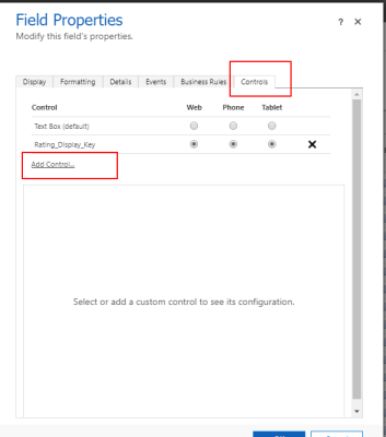
- Click on “Add Control”, select “CRMIndian_RatingControl”.
- Select Web, Phone and Tablet radio buttons to get it loaded in all the 3 device
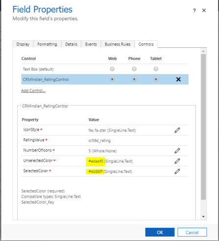
- There are 5 mandatory properties that need to be configured as shown in the figure.

8. IconStyle – sets the icon type, it can be any of the 5000+ icons available in Font Awesome library, let’s say that I want to use the star icon, I can just copy-paste the class, fas fa-star, it will be identified by the font awesome.

9. NumberOfIcons: NumberOfIcons = Max Rating. Enter the number of icons that need to display, in this, its number of stars.
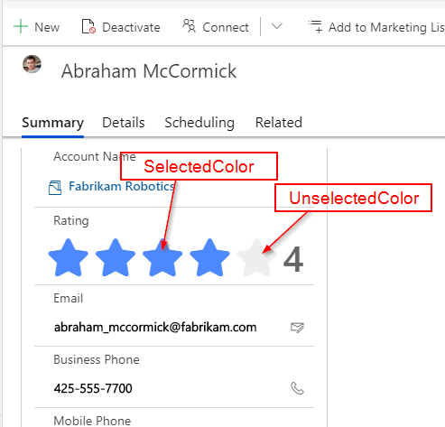
8. UnselectedColor – Enter the hex code of the default color.
9. SelectedColor – Enter the RGB values in the selected color which applies for the rated stars.
Tada, there you go, amazing, isn’t it?
Happy learning!
 CRM Indian